Ecosystem
The whole living system.
Kiduna Design System · v0.6
The ecosystem-wide reference for Kiduna brand identity, interface foundations, components, symbols, spatial interaction, Allies, media, and implementation.

01 · Brand identity
The system distinguishes the ecosystem, the Field, and its participants. Brand marks identify Kiduna; they do not replace interface icons, Realm emblems, Talismans, or Allies.


The whole living system.
How the ecosystem is perceived and navigated.
The people and Source-specific intelligences through whom the ecosystem organizes and acts.
Use the standalone mark as a signature, favicon, watermark, loading state, or card back. Do not tile or recolor it.
#FFFFE6. Moon cream #FFF6D5 is a separate symbolic highlight color.02 · Color
Espresso, sky blue, and sun gold are the primary brand colors. Secondary and extended colors support identity and differentiation. Only feedback colors have fixed meanings.
#1C140D#03CCD9#EAAA00#FFF6D5#FFFFE6#C19A6B#6F4A2E#2A1A2B#8FE6C6#3F2270#6536BB#9D7BE8#D6C7F2#1F4D38#2F8C63#57C08F#BCD3A6#A94E1C#D97B2E#F0A85C#F8D6AA#14203E#33478F#2FB4E0#ABDCE8#FF3A3A#FFCA05#00EB75Any palette color may be used for any purpose. The primary, secondary, and extended categories describe expected prominence.
Create new hues from existing colors with OKLCH hue changes or color-mix ramps. Preserve the warm, dark-native relationship to the base palette.
03 · Typography
Goudy Heavyface carries display text. Avenir carries body and interface text. IBM Plex Sans is reserved for callouts and highlighted notes.
12, 14, 16, 18, 20, 24, 30, 40, 54, and 72 px.
One upright Goudy phrase in sun gold per headline. Never italic and never sky blue.
Set prominent numbers in Goudy Heavyface. Use three significant figures in dense interfaces.
04 · Layout and material
The system uses a 4 px spacing grid, restrained corner radii, dark elevation, and motion tied to actual state changes or transfers.
| Category | Tokens | Rule |
|---|---|---|
| Spacing | 4 · 8 · 12 · 16 · 20 · 24 · 32 · 40 · 48 · 64 px | 8, 12, 16, 20, and 24 px handle most layouts. |
| Radii | 4 · 6 · 10 · 14 · 20 px · pill | Buttons use 4 px. Cards use 14 px. Pills are limited to navigation, badges, and chips. |
| Elevation | sm · md · lg · accent glow · warm glow | Shadows remain dim. Glows identify selected focal moments. |
| Studio movement | breathe 7s · drift 16s · gather 900ms · path pulse 4s | Movement must describe relevance, transfer, gathering, or change and must settle. |
| Reduced motion | prefers-reduced-motion | Provide a stable equivalent for every animated state. |
Page ground #1C140D, deep edge #120C07, surface #271B11, elevated surface #33251A.
Brand, aurora, meadow, sunrise, and dusk gradients; sky, gold, violet, and mint auras; sun and sky bursts; vignette.
Dark lacquer, warm metal rims, enamel fields, orbit geometry, restrained glow, and clearly registered identity objects.
05 · Components
The package is a reference system rather than an installable component library. It supplies tokens, base styles, preview cards, and a worked UI kit.
Squared 4 px controls. Sky is the default consequence-bearing action. Labels stay explicit.
Warm raised surfaces, visible labels, high-contrast focus state, semantic error and completion feedback.
14 px radius, warm surface hierarchy, thin borders, and quiet elevation.
Pill form is allowed for compact status, category, and filter information.
Separate references cover glyphs, images, connectors, mobile composition, and tablet composition.
Navigation, hero, stat strip, capability cards, delivery feed, engagement tiers, and interaction states.
 agent
agent alliance
 arrow right
 build
build check
check chevron down
 close
close compute
 copy
copy discover
 empower
 enact
enact govern
 inform
 kinship
 ledger
 link
link magic
magic mail
mail member
 moon
moon plus
plus search
 share
share sun
sun treasury
 tune
tunecurrentColor. The normal rendered size is 20 px. Use 16 px in dense controls, 24 px for emphasis, and 32 px only when needed.06 · Symbols
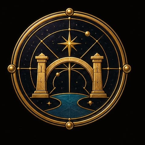
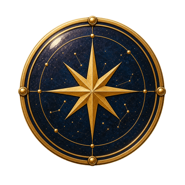
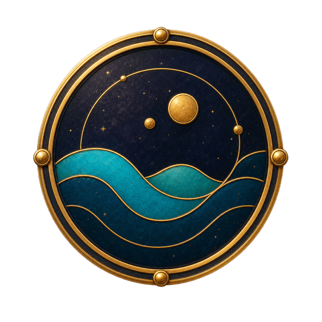
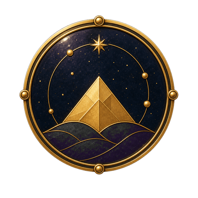
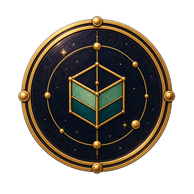
Each family has a separate semantic function. Functional icons support actions; Realm emblems identify Realm types; organization crests identify persistent organizations; Talismans carry meaning; connectors describe relationships.

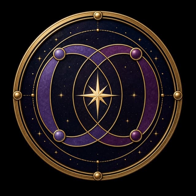
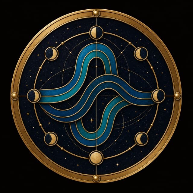
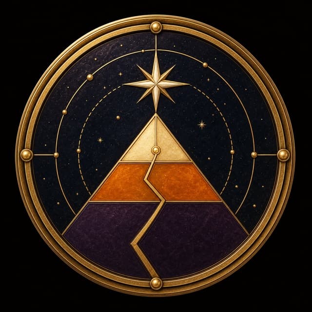
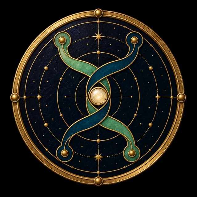
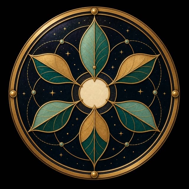

Every Realm emblem retains a circular silhouette, double warm-metal rim, cardinal anchor studs, dark lacquer core, orbit track, constellation nodes, and moon-cream highlight. Preserve each type's defining geometry and semantic hue.






07 · Allies
An Ally is the Source-approved visual identity of a person inside Kiduna. Recognition is fixed across states. State changes may alter expression, gaze, cheek sigil, and background geometry, but not identity.
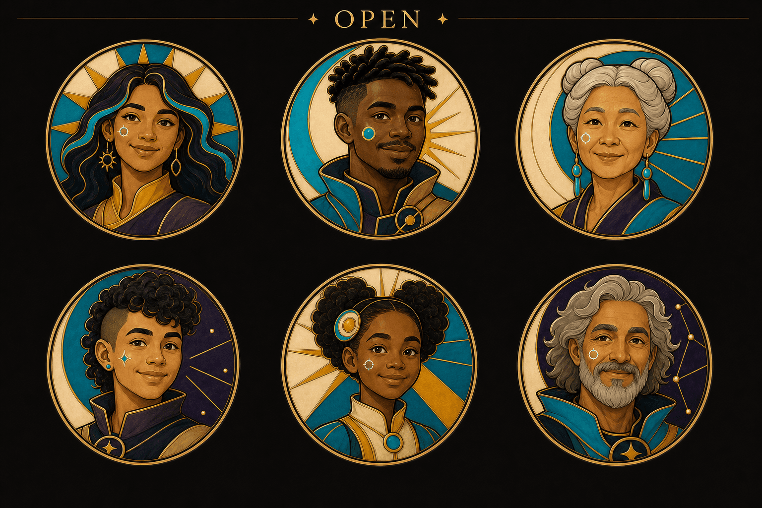
Available and present. Default state.
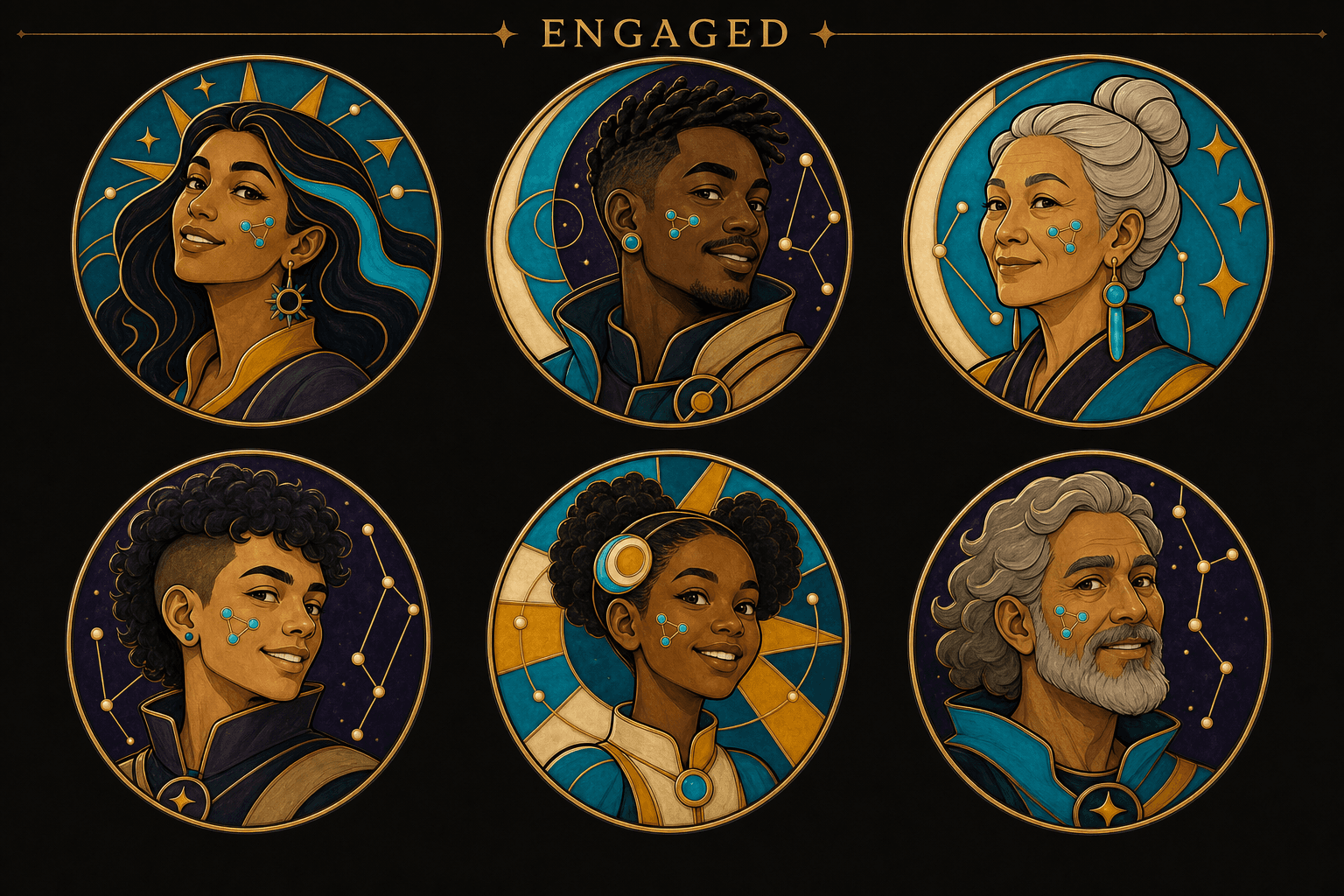
Actively collaborating or responding.
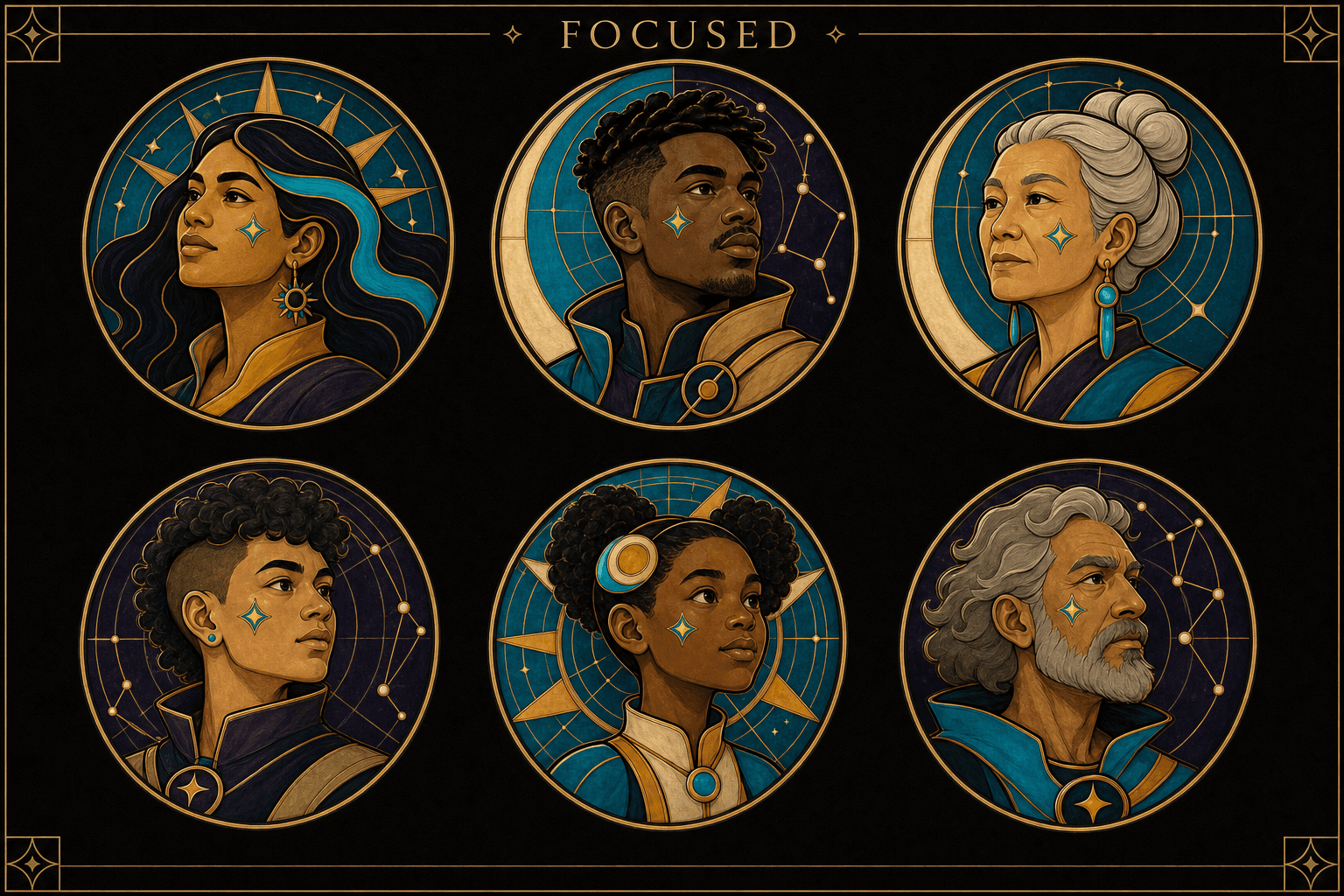
Deliberately working, reviewing, or making.
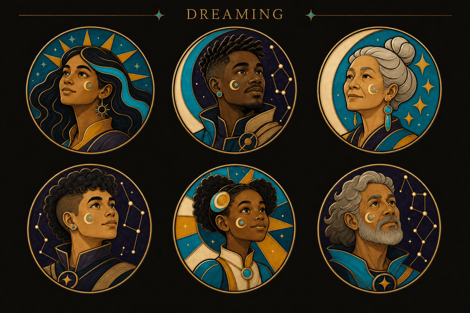
Imagining, reflecting, or exploring possibility.
Face, skin tone, apparent age, hair, distinguishing features, adornments, clothing silhouette, crop, line weight, and rim treatment remain stable.
The Source approves the canonical master and may revise, freeze, hide, or retire it. Explicit state choice overrides product-selected state.
Never communicate state through the portrait alone. Pair it with status text, a tooltip, or an accessible name.
2048 px master. Standard exports: 512, 256, 128, 64, 40, and 32 px. Lossless PNG or high-quality WebP in sRGB.
Use pre-generated state assets. Keep crop and dimensions fixed. Crossfade in 150–250 ms when motion is allowed.
Keep Source reference photos outside public presentation data. Do not use legal names or private identifiers in public filenames.
08 · Studio and Field
The Studio references define the Field ground, Realm anatomy, registered enamel objects, panels, focus, Ki surfaces, connector behavior, and responsive Kiduna Live views.
Realm, Source, Actor, Media, Resource, and Action have distinct semantic colors and object treatment.
Canonical ground #0A0604, deep ground #060304, raised surface #271B11.
Panels, focus states, and Ki interfaces must remain legible as part of the spatial system.
Resting, relevant, active, and historical opacity states distinguish relationship importance without displaying a noisy complete graph.
Rims, studs, orbit nodes, and local highlights distinguish named, persistent, and actionable objects.
Separate reference cards specify how glyphs, identity, navigation, media, and connectors adapt to constrained screens.
09 · Package
The downloadable archive is the authoritative complete package. It includes all source styles, assets, preview cards, fonts, Ally documentation, templates, worked examples, manifests, and supporting files supplied in v0.6.
Original package supplied for this reference page.
colors_and_type.css — tokens and base stylesUI Kit.html — worked interface exampledesign-canvas.jsx and Canvas.dc.html_ds_manifest.json and bundled reference dataSKILL.md — design guidance included in the package